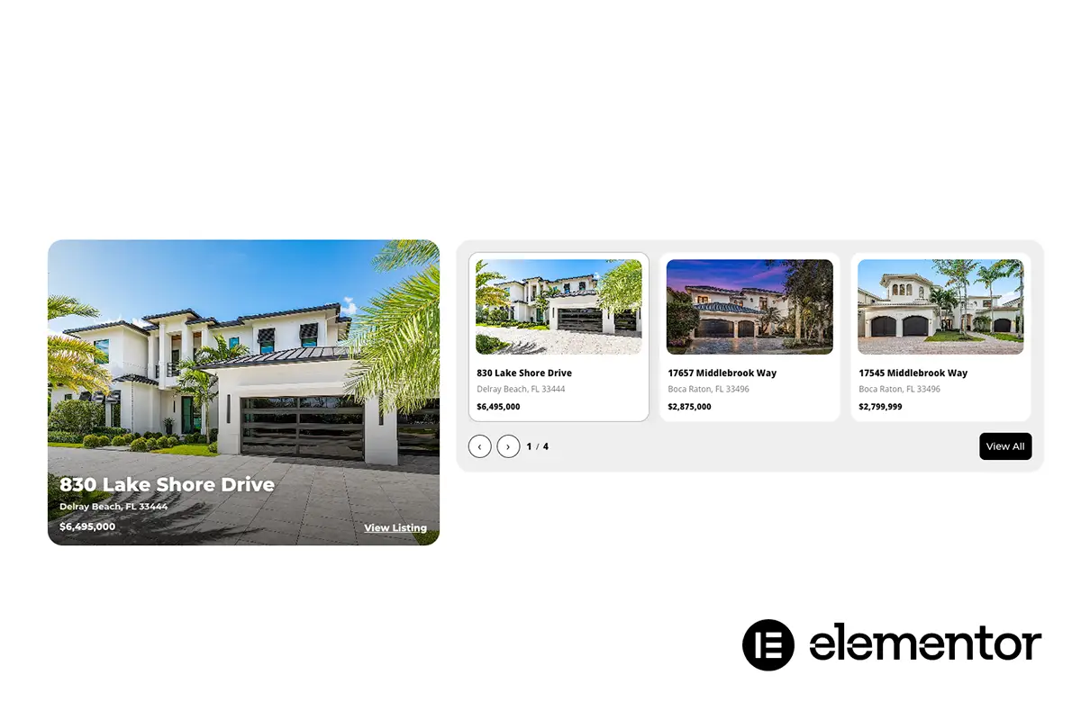
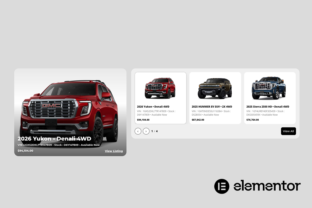
The Spotlight Showcase Carousel transforms standard slider content into a guided visual experience. Each slide is treated as a focal moment, drawing attention through intentional motion, visual depth, and responsive interaction.
Rather than cycling content passively, this carousel emphasizes engagement. Active slides are clearly highlighted, inactive slides subtly recede, and user interaction is reinforced through hover states, visual cues, and smooth transitions. The result is a carousel that feels deliberate, immersive, and easy to navigate.
Built for modern layouts, the Spotlight Showcase Carousel adapts seamlessly across desktop, tablet, and mobile devices, ensuring every featured item remains visually compelling and easy to explore regardless of screen size.
Highlighting featured content, offerings, or listings in a visually engaging and interactive format that encourages exploration and attention.
Elementor users, web designers, agencies, and developers building content-rich WordPress sites.
Key Features & Capabilities
- Featured-first layout with dominant focus area
- Infinite, continuously looping thumbnail carousel
- Seamless autoplay with hover pause
- Manual navigation via arrows and clickable thumbnails
- Featured image fully clickable with optional CTA text overlay
- Smooth hover effects with subtle image zoom and darkening
- Responsive layout optimized for desktop and mobile
Spotlight Showcase Carousel
An interactive, visually driven carousel designed to spotlight key content, features, or stories with clarity, motion, and focus.
Resource Type
Custom Elementor Widget
Required Plugins
Elementor (Free) or Elementor Pro (optional, not required)
Unlimited Elements (Free)
Control Types Included
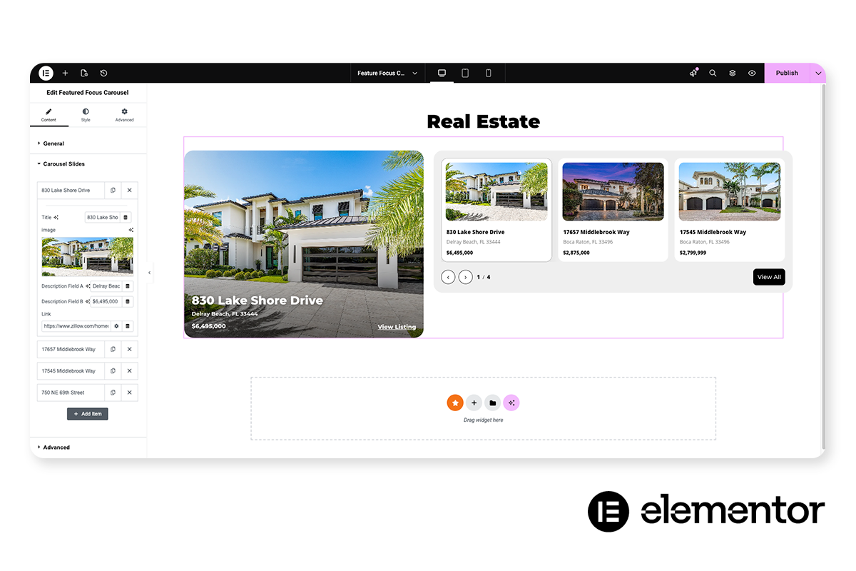
Unlimited Slide Management
Full control over the number of slides, add, remove, reorder, or duplicate slides without restrictions.
Per-Slide Content Control
Each slide supports its own unique image, heading, text, links, and optional call-to-action, allowing every slide to tell a distinct story.
Click / Tap Navigation
Users can select any slide directly by clicking or tapping the slide (or its thumbnail/card, depending on layout).
Swipe / Drag Navigation
Touch-friendly swipe on mobile and click-drag support on desktop for natural browsing.
Autoplay Timer Control
Slides can advance automatically based on a configurable transition timer.
Pause on Hover
Autoplay pauses when the user hovers over the carousel, helpful for reading or interacting.
Pause on Interaction
Autoplay pauses when the user clicks, drags, or manually changes slides, preventing fighting controls.
Loop / Infinite Cycling
Optional infinite looping so the carousel can continuously rotate without a hard end.
Transition Speed Control
Adjustable animation speed for slide transitions to match the pacing of the section.