

 By Angel Flores

On this page10 sections
Pick up your phone. Open your own website and find your contact form. Now pretend you’ve never heard of your business before today.
Would you fill it out?
Be honest with yourself. Most owners have never walked up to their own front counter as a customer, and that’s exactly what your form is. It’s the front counter of your website. It’s where a stranger decides whether you’re worth telling what they need.
In this episode, I’ll walk you through a five-minute test you can run on your own form, what your answers mean, and what I’d change. We’ll cover the questions worth asking, the different forms a business actually needs, and how to keep the spam out without locking real people out.
A pointless form doesn’t get filled out
Here’s something I’ve learned over the years. A form with little to no fields feels pointless, and pointless forms don’t get filled out.
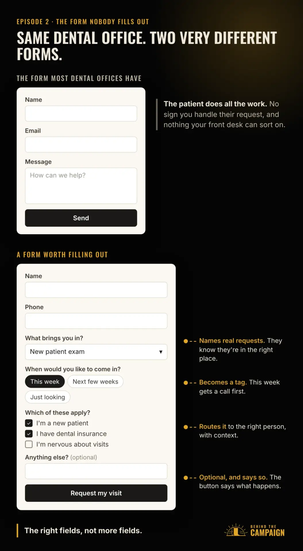
Think about the form most websites have. It asks for your name, your email and a message, and that’s it. It looks simple. But it puts all the work on the visitor. They have to figure out how to explain what they need, in an empty box, with no sign that you’ve ever handled a request like theirs.
So give them a reason to fill it out. The form should match why they came and what they’re asking for. When it does, the form itself tells them they’re in the right place.
Don’t make a contact form do another form’s job
There’s a second problem hiding in that same form. Most websites use one contact form for everything.
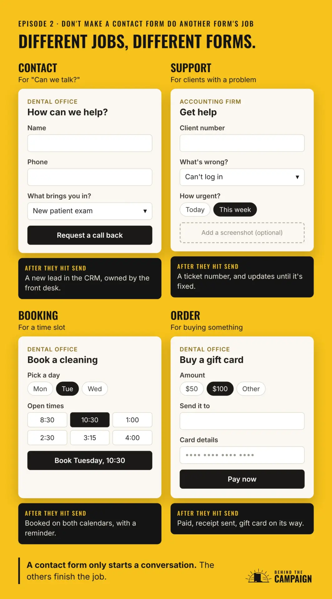
A contact form is built for one job, and that’s starting a conversation. When someone needs help, wants to book a time or wants to buy something, sending them to a contact form turns a quick task into a string of emails. So let’s go through the forms a business usually needs, and what each one does differently.
The contact form is the one you know. It’s for the person who says, "I’m interested. Can we talk?" It asks who they are and what they need, and it sends that lead to whoever owns new leads in your CRM. My Lead capture and forms page covers how to set that up, and CRM and lead systems covers what happens next.
The support form is for customers you already have, who’ve run into a problem. Think of a patient with a billing question, or an accounting client whose portal login stopped working. It asks for an account or order number, what kind of issue it is and how urgent it is, and it lets them attach a screenshot. Then it creates a ticket with a number and keeps them updated until the problem is fixed. When support runs through a contact form, complaints land in the same inbox as new leads, and nobody’s tracking whether they ever got solved. Support requests can live inside a client login instead, which is what my Client and member portals page is about.
The booking form is for a time slot, like a cleaning at a dental office or a tax appointment at an accounting firm. It shows real availability, lets people pick a service and a time, and can even take a deposit. It confirms the booking right away, adds it to both calendars and sends reminders. A contact form can’t do any of that. It just starts the "what times work for you?" back-and-forth. Booking and scheduling covers this one.
The order form is for buying something specific, like a product, a package or a gift card. It collects the product, the quantity, any options, the delivery details and the payment. Then it sends a receipt and starts fulfillment on its own. Through a contact form, somebody has to read the message, send an invoice and chase the payment by hand. My Online stores and checkout page covers this, and Invoicing and payments covers orders that need a quote first.
The intake form comes after a new client says yes. It’s the new patient paperwork at a dental office, or the document checklist at an accounting firm. It gathers everything you need to get started, all in one go. It creates the client record and kicks off your onboarding steps. Without it, you end up collecting the same details over a week of emails and calls. That’s what Client onboarding is for.
And if you take donations, the donation form lets people pick an amount, choose a one-time or monthly gift and pay right there, with a receipt sent right away. Through a contact form, a donor has to ask how to give and then wait for someone to send a link. Donations and fundraising covers that one.
So one website can need several different forms, and each one should lead somewhere different after someone hits submit.
The five-minute form test
Now let’s test yours. Grab your phone, open your form and look at it the way a stranger would. I’m going to ask you ten questions. Keep count of how many you can honestly answer yes to.
First, does the form explain what it’s for? A good form opens with a short welcome. It greets you, asks how it can help, and lets you know you’re in the right place and that someone will answer.
Second, does it ask about what you came for, or only about who you are?
Third, is there a dropdown or a set of choices that sounds like your request?
Fourth, does any question change based on your answer, or does everyone get exactly the same form?
Fifth, does every field have a reason you can see? And are the optional ones marked optional?
Sixth, could you finish it in about a minute on your phone? And when you tapped the phone number field, did the number keypad come up?
For the seventh, send the form using what’s called a plus address. That’s your normal email address with a plus sign and a word added before the at sign, like your name, plus test, at gmail dot com. It still lands in your own inbox. Did the form accept it? It should. Real customers use addresses like that too.
Eighth, if this is a sales form, send it once more using a throwaway address from a temporary inbox service. Did the form block it?
Ninth, after you sent it, did the page tell you what happens next, and when?
And tenth, look at every place on your site that says "contact us." Does someone who needs help, wants to book or wants to buy get a form built for that job, or does everyone end up in the same contact form?
What your answers mean
If the form opened with no welcome and went straight to the fields, the visitor has to guess what it’s for and whether anyone will ever read it. That’s the easiest fix on this list.
If it was name, email and message and nothing else, it works, technically. But it gives nobody a reason to fill it out, and it gives your team nothing to act on.
If it asked good questions but felt like a chore on your phone, you’ve got the right fields and the wrong build.
If it rejected your plus address, your spam rules are blocking real people. If it let the throwaway address through on a sales form, they may be letting junk in. We’ll fix both in a few minutes.
If all you got after sending it was "Thanks!", the visitor has no idea what happens next. Hold onto that one, because it’s exactly where episode three picks up.
If one contact form is doing every job, split it up. Support, bookings and orders each deserve their own form.
And if you said yes to most of the ten, you’re ahead of most businesses. Go run the test in episode three next.
Greet them like a good receptionist
So that’s the test. Now let’s fix what it found, starting at the top of the form.
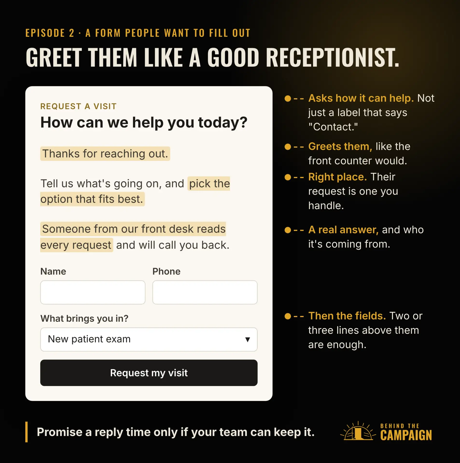
Your form is the front counter, so it should do what a good receptionist does. Greet the visitor. Welcome them. Ask how you can help today. And let them know they’re in the right place and that someone will get back to them. Two or three short lines above the first field are enough.
On a dental office’s contact form, that might sound like this: "Thanks for reaching out. Tell us what’s going on, and pick the option that fits best. Someone from our front desk reads every request and will call you back."
On an accounting firm’s support form: "Sorry something isn’t working. Tell us what happened and you’ll get a ticket number right away, so you can follow it until it’s fixed."
On a booking form: "Let’s find a time. Pick the visit you need and a time that works for you. You’ll get a confirmation now and a reminder the day before."
And on an accounting firm’s intake form: "Welcome aboard. This gathers everything we need for your return, so we can skip the back-and-forth and get to work."
One caution. If you promise a reply time, use one your team can actually keep.
Ask questions that name real requests
Next, the questions themselves. Dropdowns and choices that name real requests tell a visitor two things. Their request is common here, and someone has thought it through.
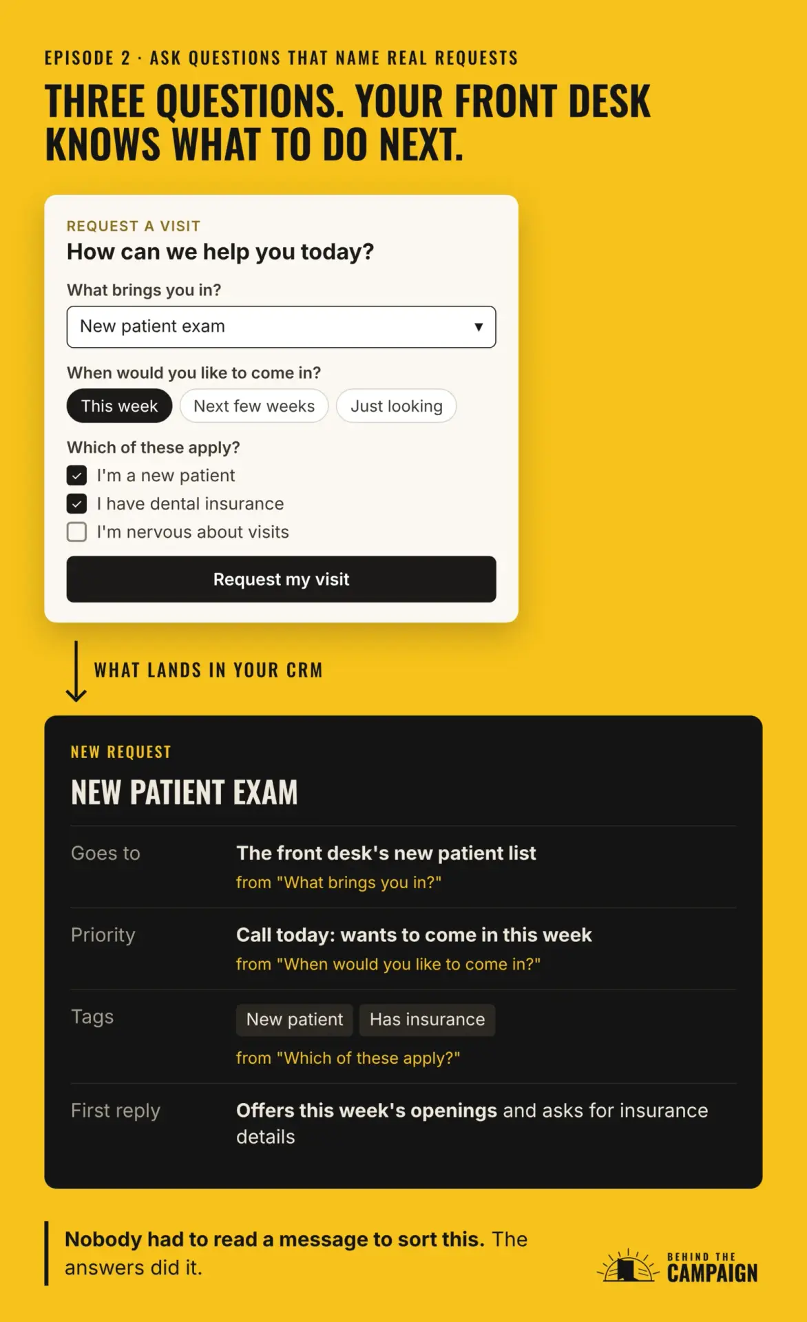
Here’s what that looks like at a dental office. A dropdown that asks "What brings you in?" and lists the real reasons people call: a new patient exam, a cleaning, tooth pain or an emergency, or a cosmetic consult, with "Something else" at the bottom. A question like "When would you like to come in?" with three choices: this week, the next few weeks, or just looking. And a "Which of these apply?" question where they can pick more than one, like "I’m a new patient," "I have dental insurance" or "I’m nervous about dental visits."
An accounting firm would ask the same kinds of questions about different things. "What can we help with?" might list a tax return, bookkeeping, payroll or business advice. "When do you need this done?" might offer before the filing deadline, this month or no rush. And "Which of these apply?" might include "I own a business," "I have employees" or "I’m behind on filing."
Here’s the part most people miss. Those same answers are what let a lead go to the right person, get tagged in your CRM and get a reply that’s about their actual request. An empty message box gives your team nothing to work with. Someone has to read every single message before anyone even knows who should answer it.
That doesn’t mean more fields. It means the right fields. Every field should earn its place, either by helping the visitor feel understood or by helping your team reply better.
Make it effortless
Short and specific beats long and vague. You want a form that feels considered, then takes about a minute to finish. I use four rules for that.
The first rule is to cut anything you won’t use right away. If nobody acts on a field in the first reply, drop it. If an accounting firm asks for a fax number and nobody’s ever faxed anyone back, it doesn’t need to be there. And anything optional, like a file upload, should say so.
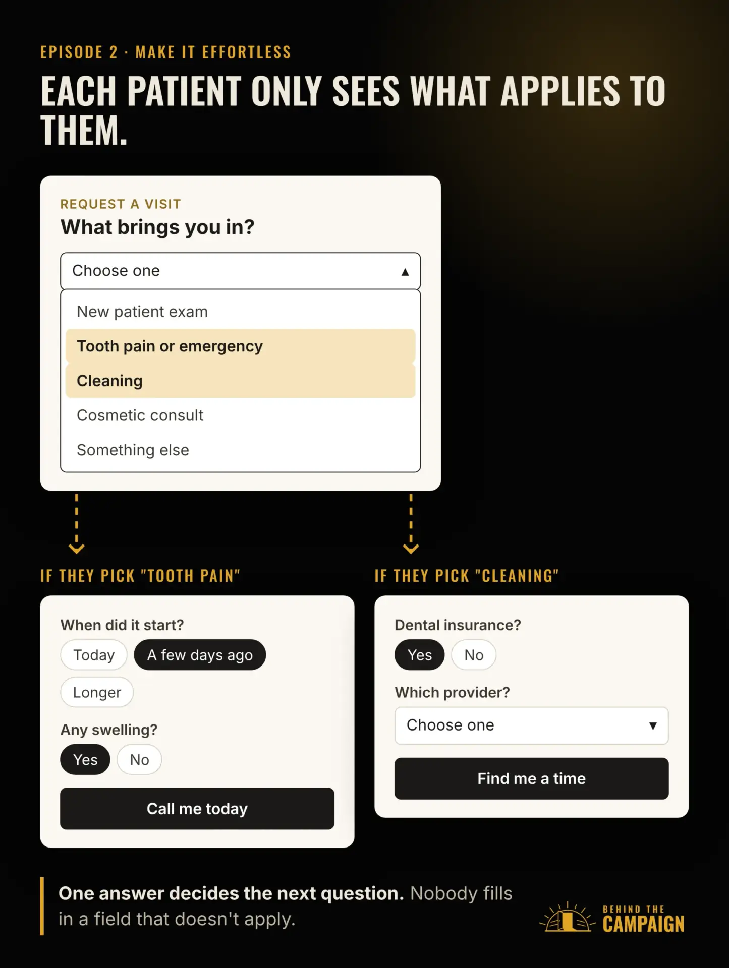
The second rule is to use conditional logic. That just means the form shows or skips questions based on earlier answers, so nobody sees a question that doesn’t apply to them. On a dental office’s form, someone who picks "Tooth pain" gets asked when it started and whether there’s swelling. Someone who picks "Cleaning" gets asked whether they have insurance instead. On an accounting firm’s form, picking "Tax return" brings up one question, personal or business.
The third rule is to match each field to the answer it’s collecting. Use a proper email field, phone field, date field, or choice and rating fields, so people can answer quickly and get it right. A real phone field brings up the number keypad. A date picker beats "type your preferred date." And when there are only four real answers, four buttons beat an empty box.
The fourth rule is to design for the phone first. Preview the form on a desktop and on a phone. Check the spacing, the button size and whether you can read it without zooming in. You want a submit button your thumb can hit easily, and labels that stay visible after you start typing.
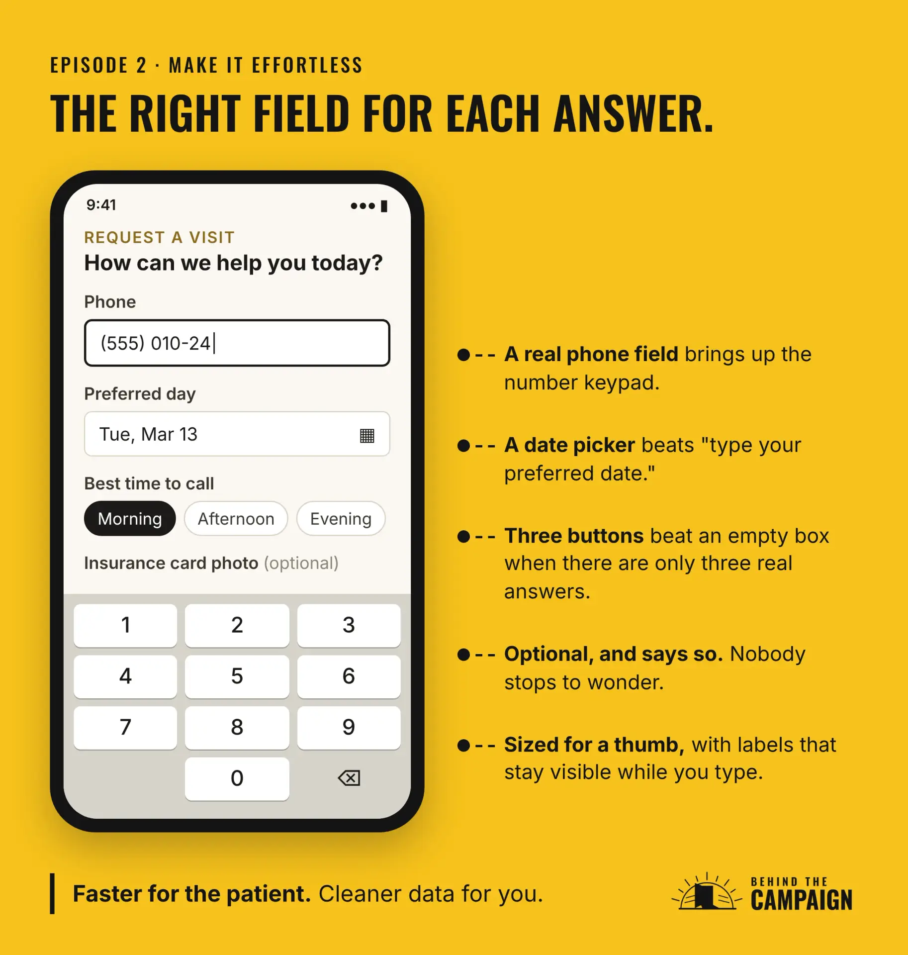
There’s a bonus to all four. They give you cleaner data. A real phone field collects a real phone number, and a dropdown gives your CRM a value it can sort on.
Keep the spam out without locking people out
Now, spam. Spam is the reason a lot of teams stop paying attention to their forms. The inbox fills up with junk, people stop checking it, and then a real lead sits there for three days.
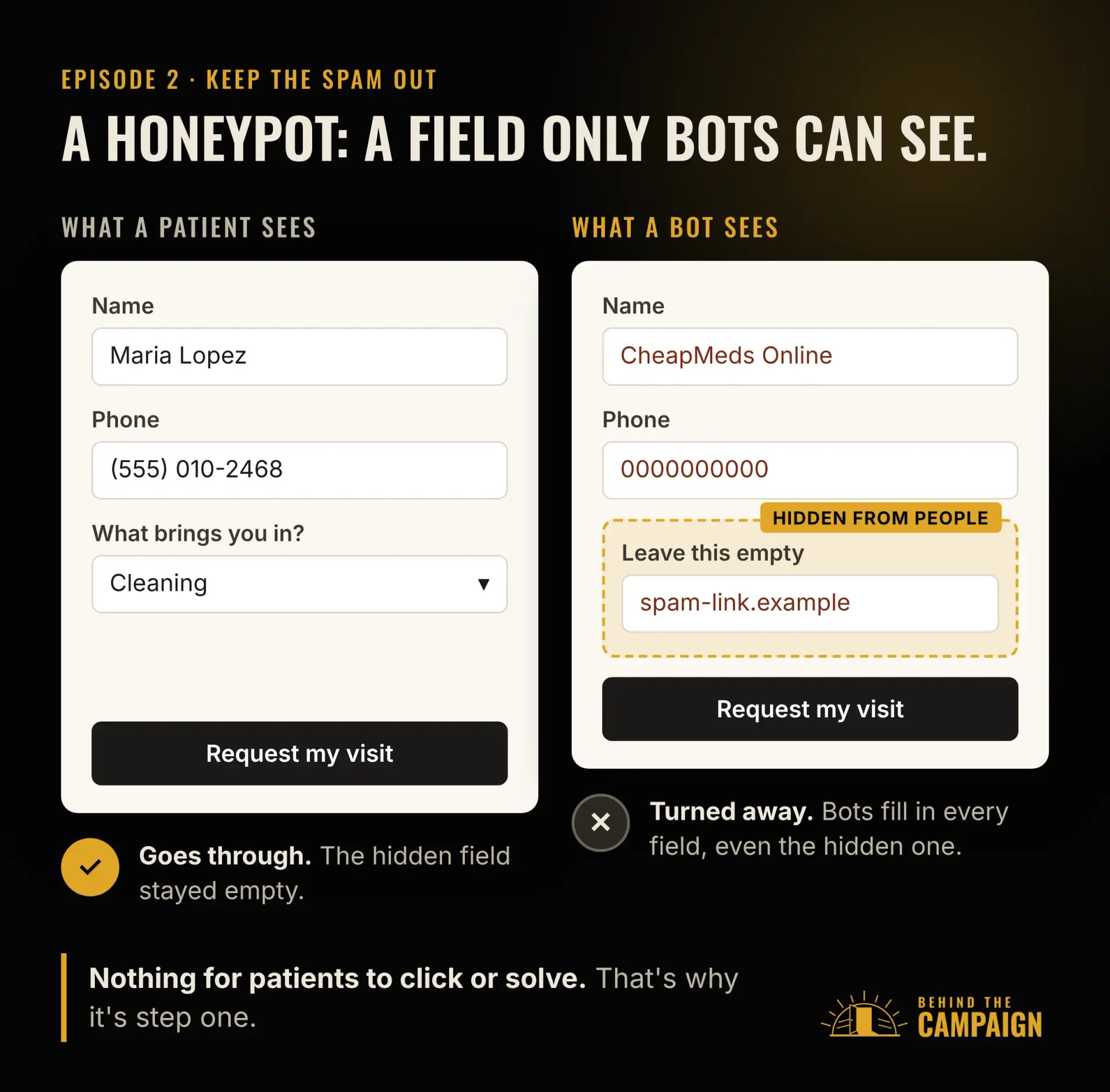
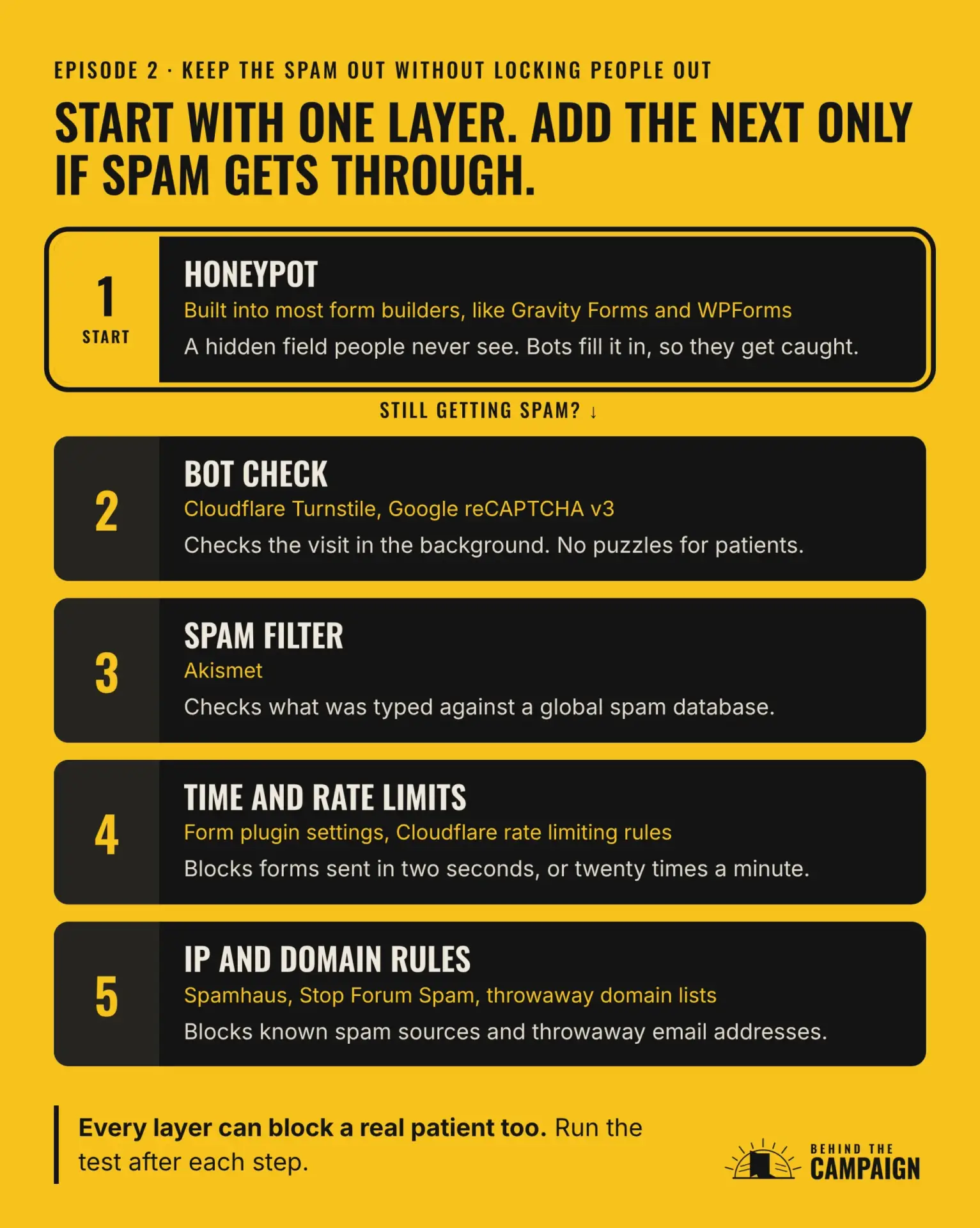
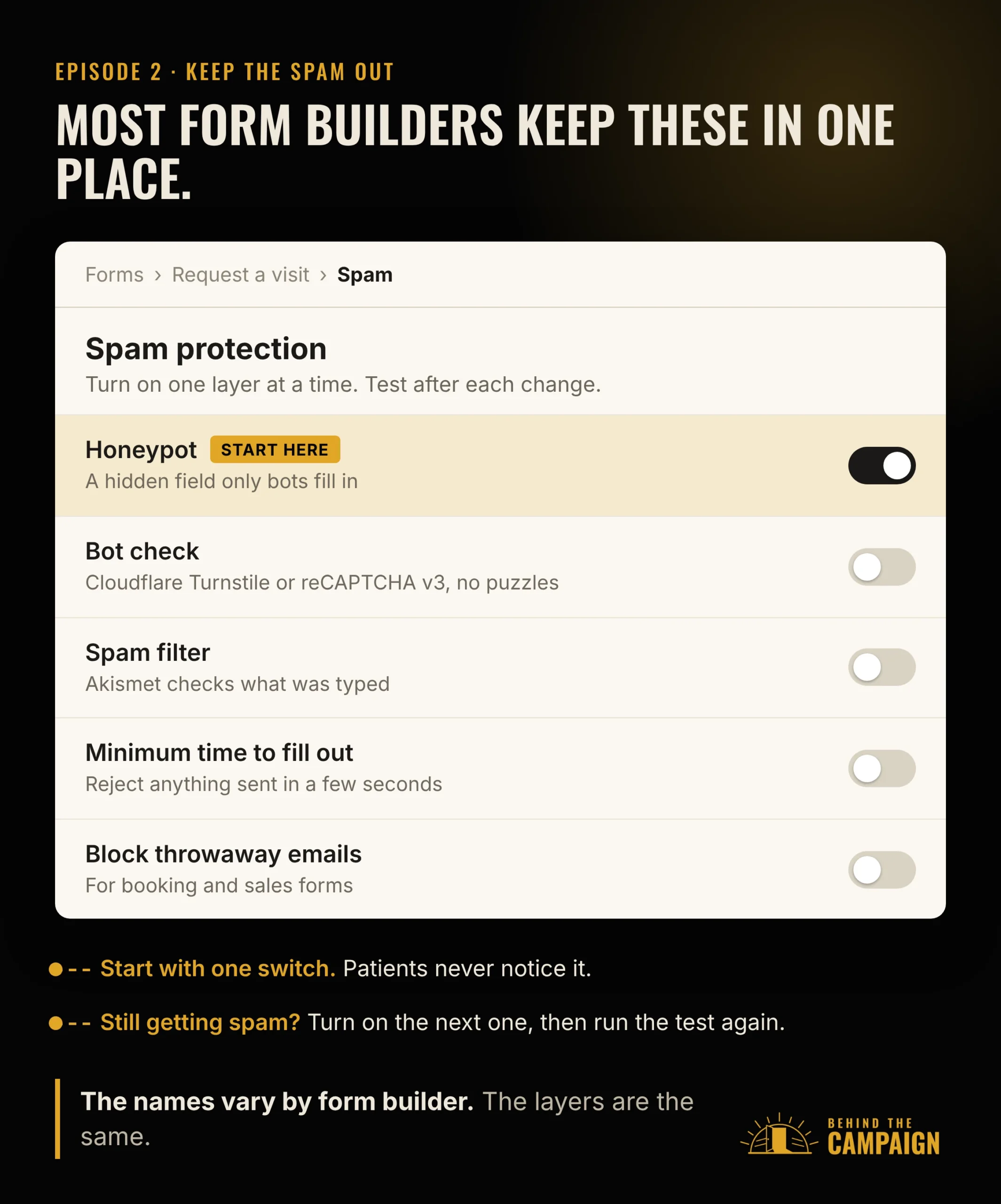
My approach is to start simple and only add more when you need it. Every form starts with a honeypot. If spam still gets through, you add the next layer, one step at a time.
A honeypot is a hidden field that people never see. Bots tend to fill in every field they find, so if the hidden one comes back filled in, that’s a bot. Your visitors never notice it’s there. Most form builders, like Gravity Forms and WPForms, include one, usually as a setting you switch on.
If spam still gets through, the next step is a bot check. That’s the "are you human?" check, but without the puzzle. Cloudflare Turnstile has a free plan, can check visitors without showing them a puzzle at all, and works on any website, even if you don’t use Cloudflare for anything else. Google’s reCAPTCHA version three also checks visits quietly in the background. What I’d skip are the old puzzles that make you click every traffic light. They cost you real leads.
Still getting spam? Add a spam filter. Akismet, from the company behind WordPress dot com, checks each submission against a global spam database before it ever reaches you. It works with Gravity Forms, WPForms, Contact Form 7, Elementor forms and others.
After that come time and rate limits. A real person doesn’t finish a form in two seconds, and doesn’t send it twenty times in a minute. Many form plugins have a minimum time setting, and Cloudflare’s rate limiting rules can cap repeat submissions.
The last step is rules about where a submission comes from. You can block known spam sources, using lists published by groups like Spamhaus and Stop Forum Spam. You can also block throwaway email domains, common spam phrases and messages stuffed with links.
On throwaway email addresses, it depends on the form. On a sales inquiry, block them. On a free download, think twice, because some real people use them to protect their inbox.
Here’s the catch with all of it. Every layer that blocks spam can also block a real lead. That’s why you run the test again after each step you add.
I’ve used WordPress examples, because a lot of the businesses I work with run WordPress. Other form platforms have their own version of each of these. And naming a tool here isn’t an endorsement. It’s just what you’ll see when you go looking.
For newsletter and download forms, there’s one more spam filter worth knowing about, called double opt-in. We’ll get to it in episode three.
Tell me what you found
If you only remember three things from this episode, make it these. A form with nothing to fill out feels pointless. Every job deserves its own form. And with spam, start simple and add a layer only when you need it.
So run the test this week. Then book a free call and we’ll go through what you found together. I’ll show you the other places on your site worth a second look, the same way we just looked at your form.
And keep reading, or keep listening. Every episode of Behind the Campaign takes one piece of the engine behind your marketing and shows you how to check it yourself. In episode three, we’ll find out what happens after someone actually fills out your form.
